Sonco Safety Marketplace
Improving a checkout flow to reduce friction and convert more.
Key metrics
+37.5%
Website Conversion Rate
From 0.8% to 1.1% in six months
-33%
Time to Checkout
From 0.8% to 1.1% in six months
SONCO is a US-based company that specializes in perimeter protection and safety barriers
for construction sites, serving contractors and construction companies through their B2B e-commerce platform.
role
Product Designer
Responsabilities
• Data analysis
• Competitor analysis
• UI Design
• Competitor analysis
• UI Design
Challenges
• We didn’t have the budget or time to run usability tests.
• Some third-party integrations and tools made some of the proposed improvements impossible to implement.
• Some third-party integrations and tools made some of the proposed improvements impossible to implement.
Problem statement
SONCO’s checkout had an extremely high abandonment rate (93%) because B2B users couldn’t quickly confirm the total purchase cost, especially shipping, and critical information was spread across a long flow.
As a result, many users either paused the journey to contact a sales representative or abandoned the purchase. The challenge was to increase the session-to-checkout conversion rate and reduce time to complete the purchase, without increasing traffic spend.
As a result, many users either paused the journey to contact a sales representative or abandoned the purchase. The challenge was to increase the session-to-checkout conversion rate and reduce time to complete the purchase, without increasing traffic spend.
solution
Increase conversion and reduce abandonment by simplifying the purchase flow, surfacing shipping costs without a login wall, and reducing the number of steps to lower the perceived time and effort required to complete checkout.
Findings
The data revealed a cart abandonment rate of 93% — significantly above the market average of 70% (50 Cart Abandonment Rate Statistics 2026 – Baymard Institute). After several rounds of discovery and UX audits, we identified the main user pain points:
❌ The primary user profile wanted to see shipping information before logging in or creating an account, because in many purchases the shipping cost exceeds the product value.
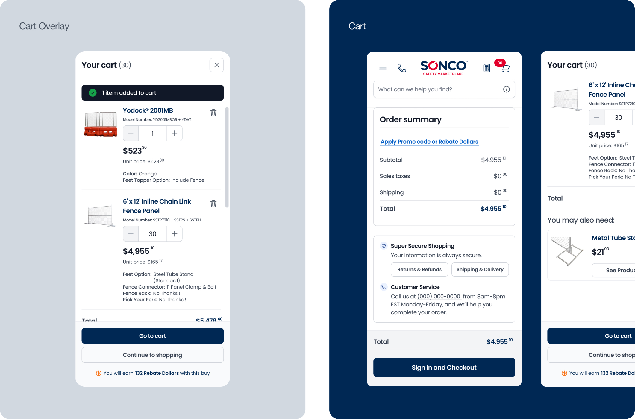
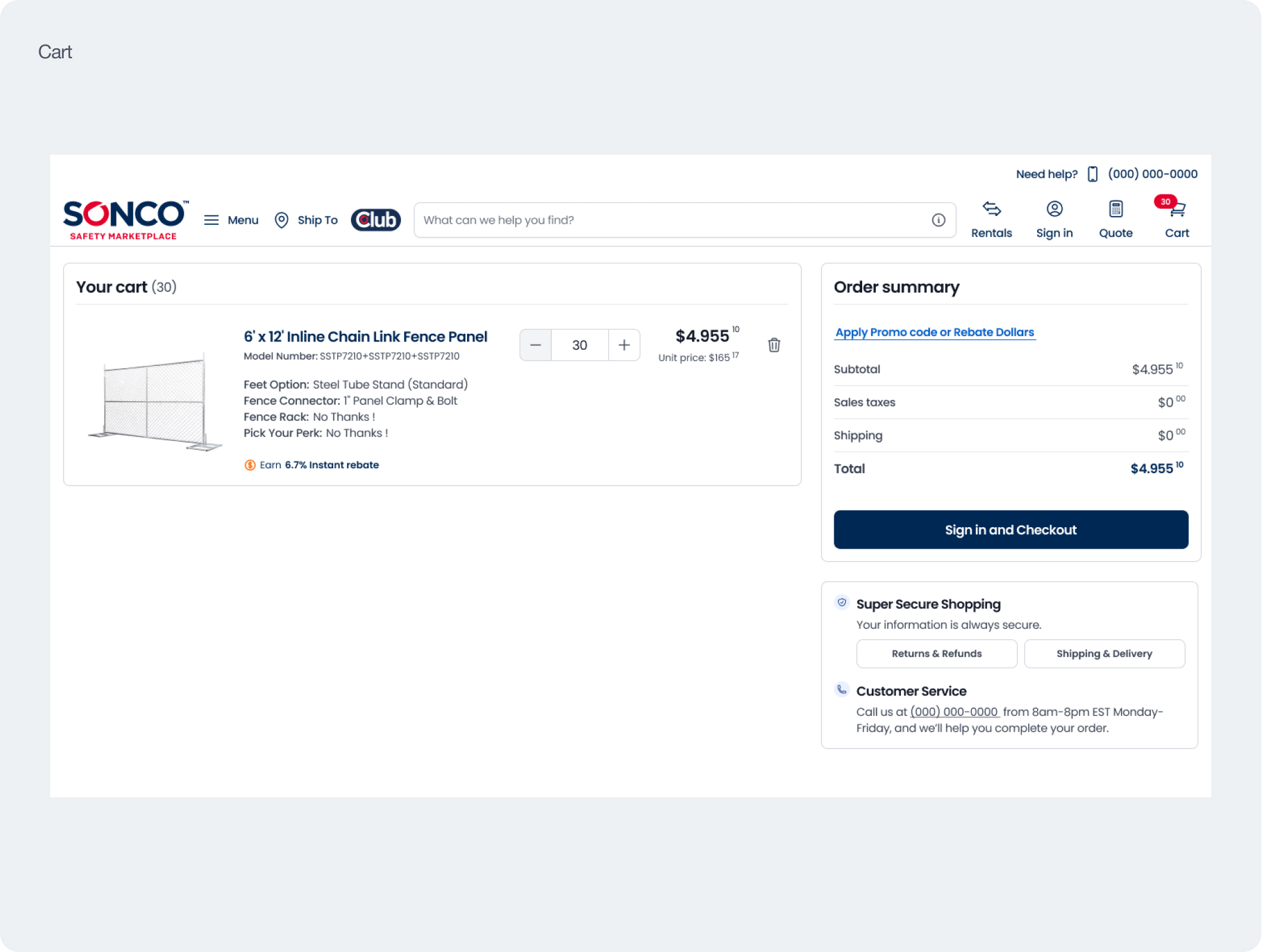
✅ We redesigned the Cart screen with visible shipping for users without login
✅ We redesigned the Cart screen with visible shipping for users without login
❌ Many customers couldn't find all purchase information on the same page, so they would break the flow by calling a sales representative or abandoning the purchase
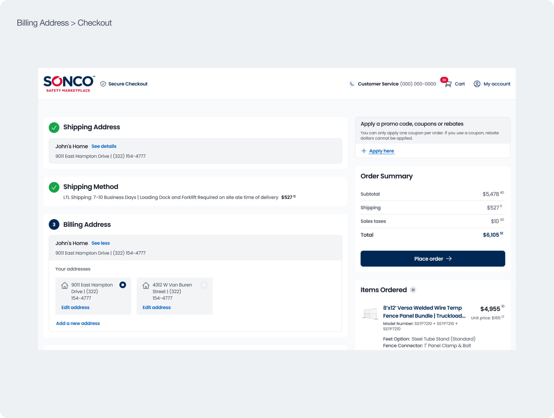
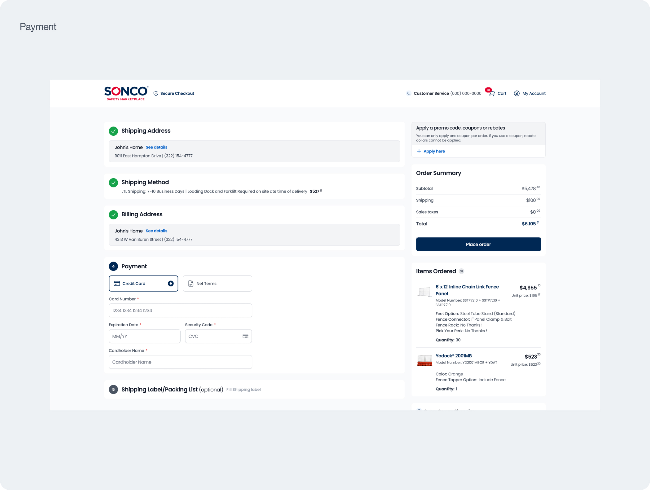
✅ We reduced the number of pages from 4 to 2 (cart & checkout) to reduce friction
✅ We reduced the number of pages from 4 to 2 (cart & checkout) to reduce friction
❌ The checkout flow was unnecessarily long; the site didn't take the journey context into account—for example: even when only one shipping option was available, the customer was forced to select it to proceed.
✅ The new flow calculates shipping options for the customer and offers only the best ones; if only one is available, the customer goes directly to the payment stage.
✅ The new flow calculates shipping options for the customer and offers only the best ones; if only one is available, the customer goes directly to the payment stage.
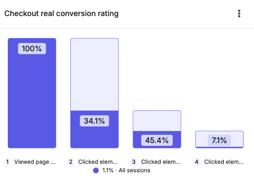
Checkout conversion 7% vs 93% abandonment (Hotjar print screen)
Target personas & buying behavior
The marketplace serves multiple industries and, as a result, different personas. To drive real business impact,
I aligned with stakeholders to focus first on the two most profitable verticals (construction and events), leaving the other 10 for a later phase.
Although these segments are different, users in both verticals purchased in very similar ways.
Interviews with the sales team highlighted the main pain points:
- Out-of-state shipping
- Overall company speed and responsiveness
- Before becoming buyers, a common behavior is price checking: users request quotes across multiple websites, so speed of response can be a deciding factor.
- When an order exceeds $2,300 on average, users often prefer to contact a sales representative by phone or email instead of completing the purchase on the website. This was confirmed by the sales team and aligns with the site’s 2024 AOV data.
Risks, challenges and trade-offs
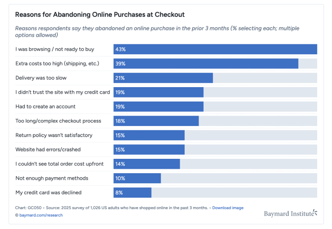
According to the Baymard Institute, 39% of users abandon checkout after discovering extra costs (such as shipping) too late in the flow, and 19% drop off when they are required to create an account to complete the purchase.
Another study from the institute also shows that, in the cart, users tend to use “Save for later” more often than the product “save” or favorites feature.
Based on these insights, I proposed Guest Checkout and Save for later in the first version of the solution.
However, these features were deprioritized because they would significantly increase development time and were not compatible with the site’s current structure.
Market and user research
The checkout evaluation combined quantitative data with qualitative analysis.
We used Google Analytics and Hotjar to map funnels and review session recordings, pinpointing exactly where the journey was breaking down.
In parallel, we ran a manual benchmark to compare the flow against market best practices. Based on this evidence, the audit surfaced three main issues:
- The 4-step flow (as implemented) caused confusion and increased time to complete the purchase.
- Users who simply wanted to confirm the final price including shipping hit a login wall early in the journey.
- The checkout did not account for journey context: even when there was only one shipping option, logged-in users still had to select it to proceed, which is where most time was being lost.
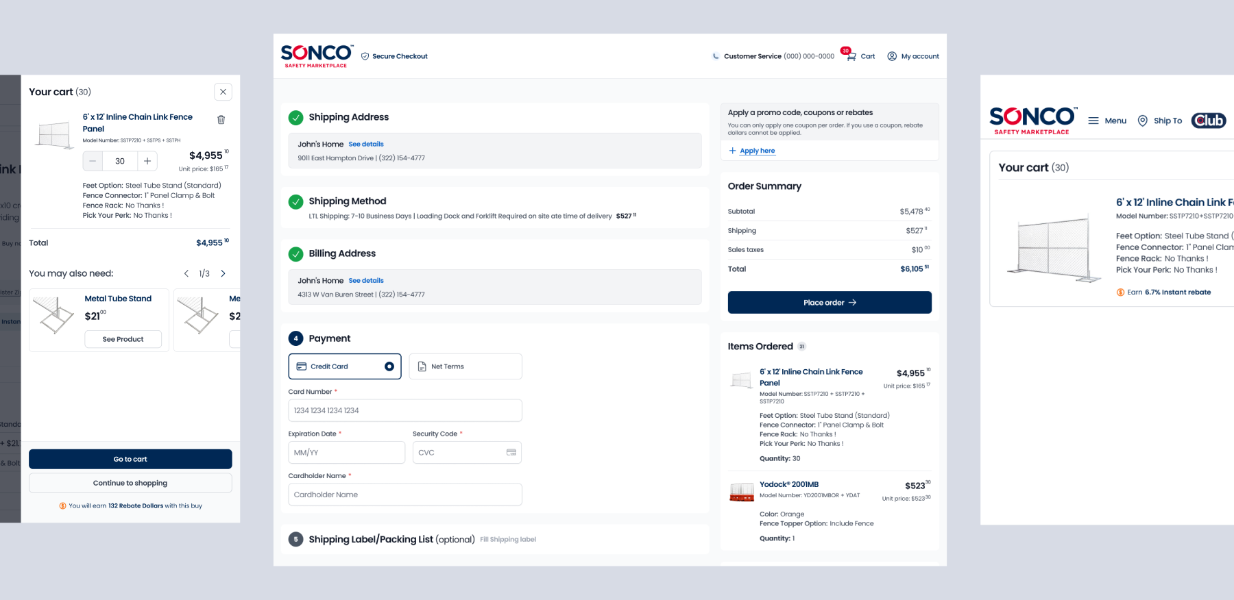
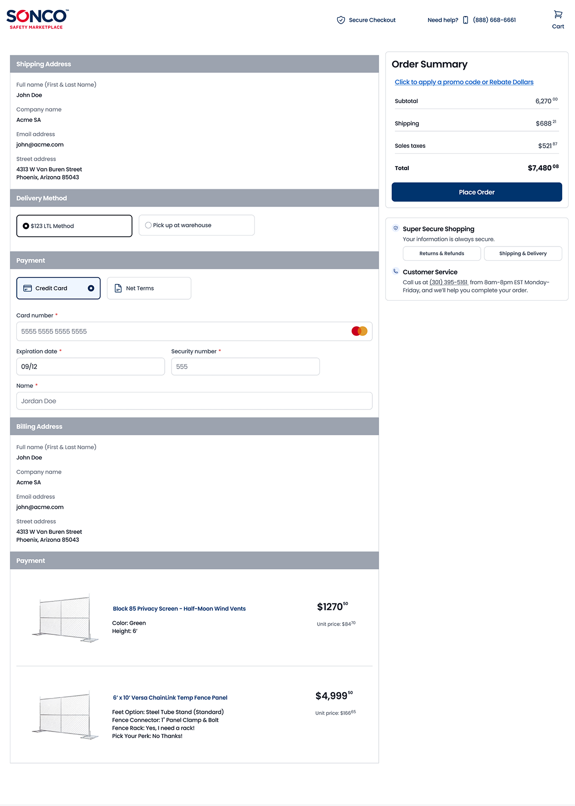
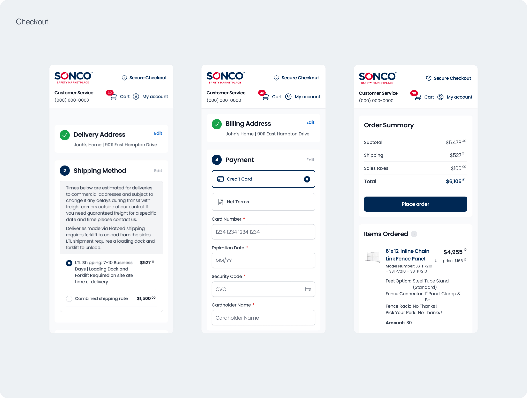
wireframes and design
After several explorations, I concluded that the best approach was to keep checkout on a single page, with a separate cart page—
a standard market pattern.
Wireframe:
a standard market pattern.
Wireframe:
Different approach to handoff
SONCO does not work with Scrum or separate squads. Typically, handoffs happened in a single call. For this project however, I believed continuous alignment was essential. I therefore ran weekly check-ins through final delivery, working one flow at a time and ensuring enough time to validate decisions and deliver at a high quality bar.
project Stats
4 months
design, mapping and documentation
6 months
following up the development
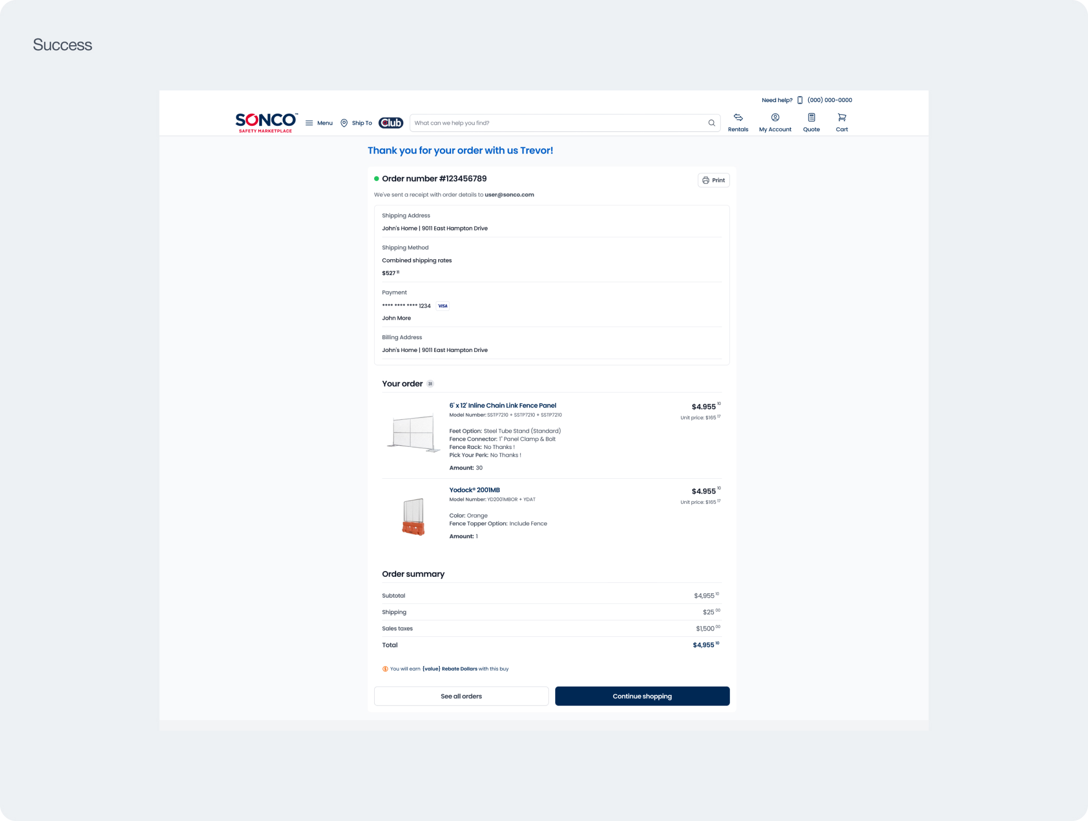
Final product
Impact
+37.5% conversion (sessions → checkout) and a 33% reduction in time to complete checkout — critical metrics for an audience that needs to move fast. Beyond the quantitative impact, the project uncovered performance improvements that could not be implemented in the short term due to reliance on a third-party shipping calculation tool. These findings directly triggered a new shipping-calculation initiative, launched as a result of the insights uncovered during this checkout project.
Key metrics
+37.5%
Website Conversion Rate
From 0.8% to 1.1% in six months
-33%
Time to Checkout
The data timeframe is six months post-rollout. The annual estimate is that the project will recover over $100K within a year.
Thoughts
It was very interesting to lead this project end-to-end. The biggest challenge was definitely communication to ensure that the content, development, and QA teams understood the project with all its technical nuances.
At the same time, it was great to have the freedom from the company to propose improvements and lead the project to ensure on-time delivery with the necessary quality.
At the same time, it was great to have the freedom from the company to propose improvements and lead the project to ensure on-time delivery with the necessary quality.